Do you remember that time I posted the YouTube video on how to tone greens in your photographs in Lightroom Classic? Well, the game has changed and we’re now overdue an update. Greens get a bad rep in portrait photography, often because the photographer doesn’t have a great white balance on the go, but also because some cameras make an absolute car crash of the hue… *cough* Sony *cough*. (I shoot Sony, so don’t come at me).
When we have some icky hues (aka, colours) in an image it’s fairly easy to treat them. Don’t worry, of course, I’ve included a video step-by-step of exactly how I tone greens in photographs with Lightroom Classic. You can also do the exact same steps in Camera Raw and Camera Raw Filter in Photoshop, and there is additional details on range selections lower down in this post:
Let’s run through some of the basic steps:
How to start toning greens:
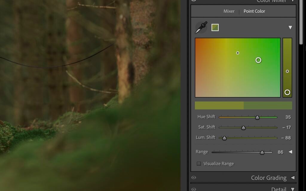
Head to the develop tab in Lightroom Classic, and scroll down to Color Mixer in the left-hand tabs. Select Point Color from the top mini-menu:
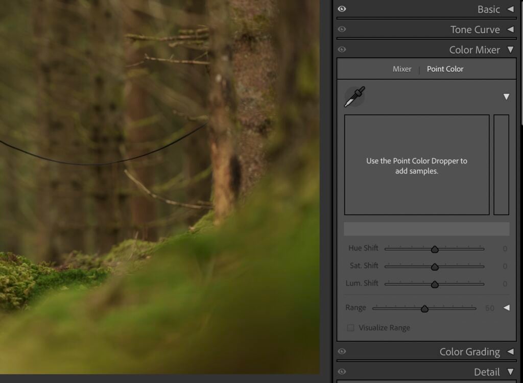
Next, use the eyedropper to select a colour you’d like to change. You’ll then have the sample locked and loaded in the Point Color window. It’s important to understand the simple anatomy of this section because it will help you make changes quicker. Here’s some basic Point Colour anatomy:
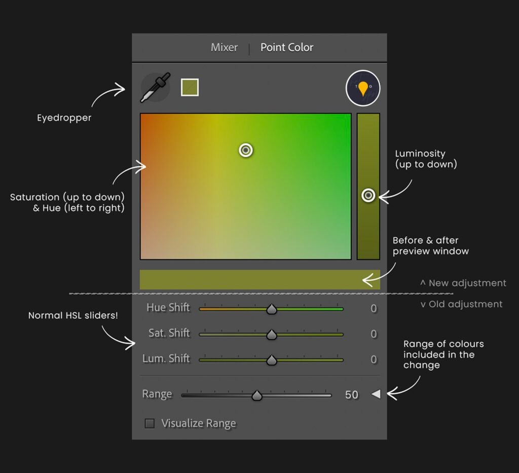
So with that knowledge, we can move onwards:
How I tone my greens with Point Color:
- First, I start by shifting the hue to the left, to make it cooler
- Next, I reduce the luminance considerably to really darken off the hue itself
- Finally, I alter the saturation to suit the image. In this case, I pulled it down a touch.
The result on the sliders inside Point Color is shown below:
What to do if the colour change in Lightroom alters the subject?
Don’t panic! You have two options:
Option 1: Alter the range with detail:
In the anatomy graphic you’ll notice that the range tab is all closed up. Inside here though, there are some fine-tuning gems that are worth discussing. Below is a graphic displaying the different parts, but essentially there are ranges that you can close, either with the internal box or with the outer pins, to really get specific on your selected colour.
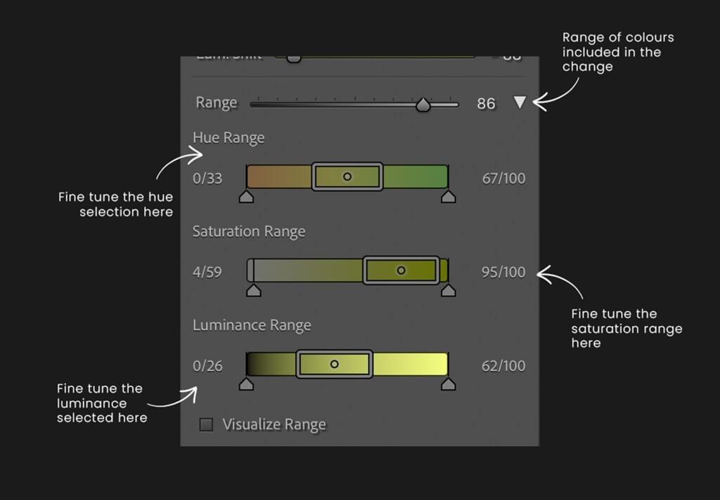
Have a play with the options available in this section to see if that does the trick, but if not, continue below:
Option 2: Move into masks:
In most cases, sadly, if the original sample is also adjusting the subject, you’ll need to abort mission in Point Color by right-clicking on the offending swatch and choosing to delete the swatch. Next, head into Masks and choose a background selection.
Then, scroll down to Point Color and do the offending swatch selection again. Because the background is the only thing that is selected in this mask, the adjustment will be completely independent of the subject.
You can still fine tune the range, but take care to keep the outer pins on the fine runing as far away from the box as possible, because they can cause solid edges around colours if you are not careful. If you’re struggling to see what is and isn’t selected, go ahead and hit the “Visualize Range” checkbox. Everything that is selected will be in colour, and everything that is not selected will be black and white.
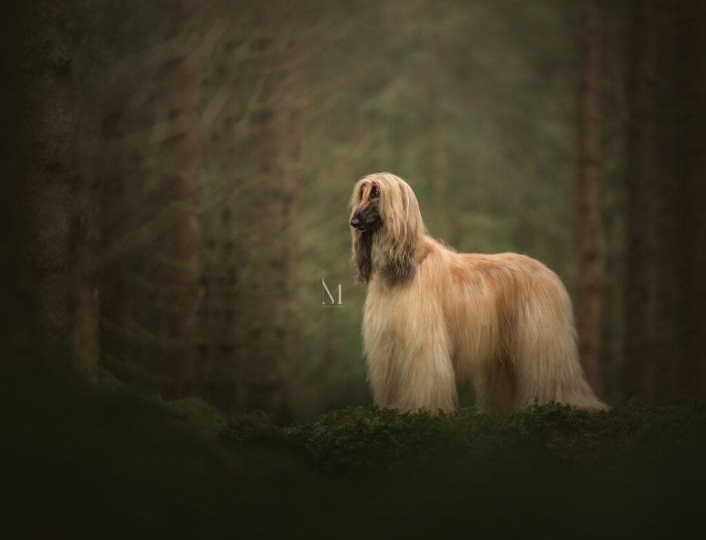
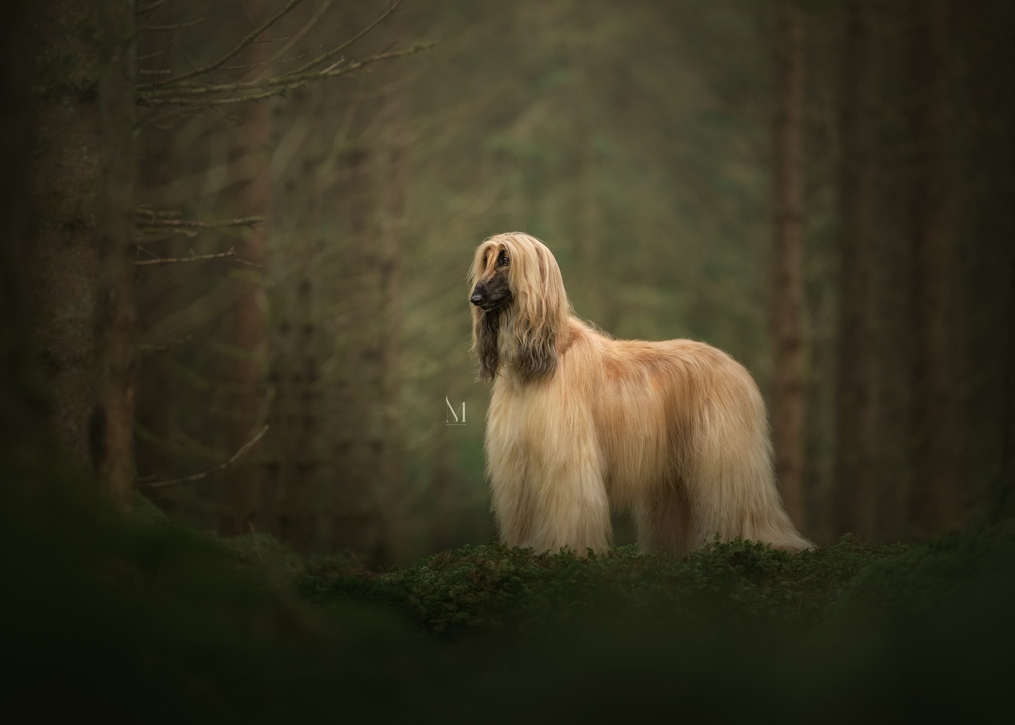
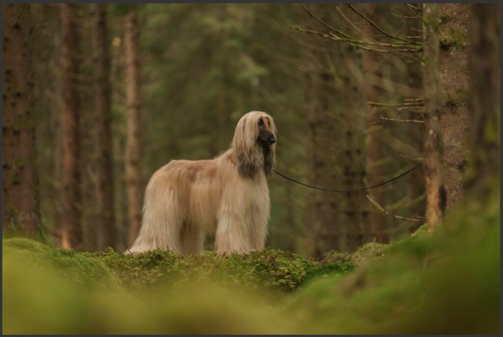
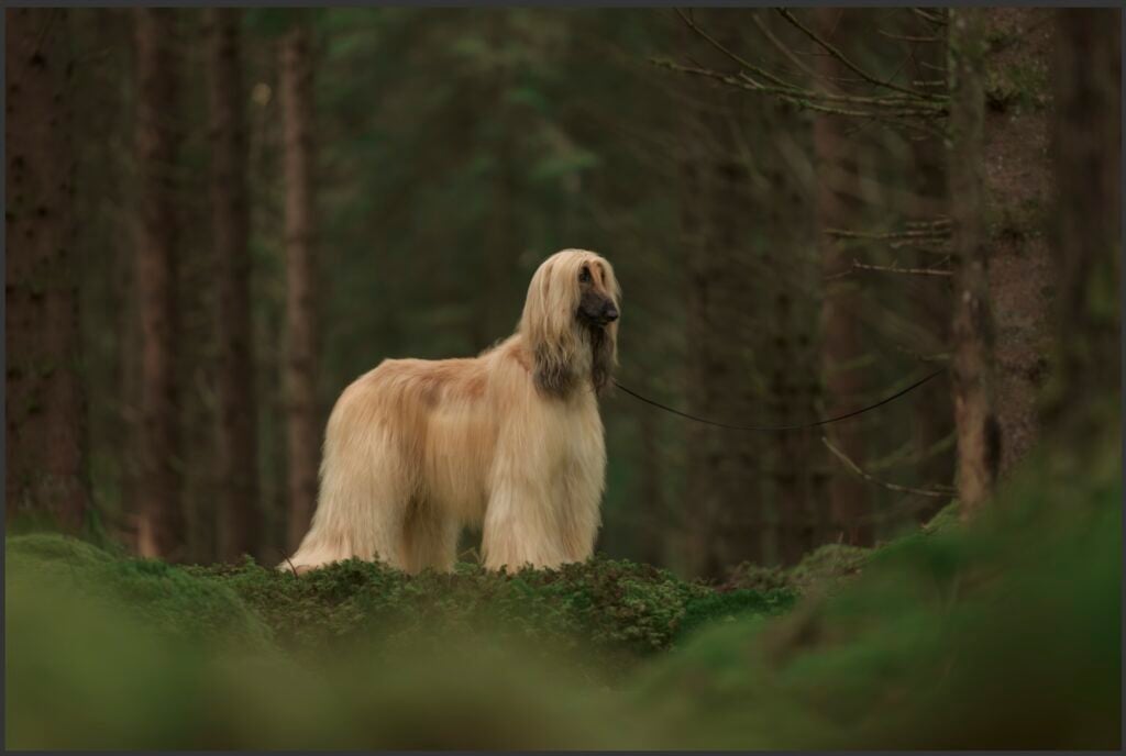
Utilising a mixture of these methods, we end up in Lightroom only with this result: (before left, after right)
Then, the image can be taken into Photoshop to do some magic, the Online Advanced Course workflow, and will pop out looking a little bit like this: